Back in 2017 I was the feature artist for Booklife’s “Cover Redesign” feature which was printed in the monthly Booklife edition in Publisher’s Weekly magazine. One of the covers I redesigned for this column was a A Daughter’s a Daughter by Irene Vartanoff.
Book description: Three generations of women in a family struggle with conflicting needs, desires, and opportunities that put them at odds with each other. Widowed Pam Ridgeway wants to mobilize a charity to help laid-off workers after losing her own job in a mass Wall Street meltdown. But creating a new charity will thrust her into the public eye, which she’s always hated, unlike her estranged daughter and intimidating mother. Yielding to their insistence on publicity tactics takes Pam totally out of her comfort zone—until she meets Bruce, her mother’s handsome new neighbor at her Long Island beachfront home. Bruce is sympathetic, easy to talk to, and attracted to Pam. But Bruce has a secret agenda involving her mother and a mystery from the past. Pam’s daughter is a fiercely ambitious cable financial reporter with an agenda of her own about the hottie she works with. She fights to keep a lid on her desire, otherwise their passionate attraction could burst into flames in the newsroom and destroy their careers. Pam’s mother wonders why Bruce reminds her of someone from the past. In a long life filled with social activism, she has met many people, but there’s something about him…
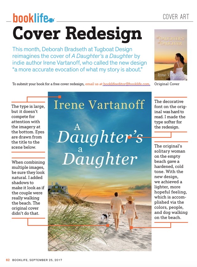
Here are the two covers side-by-side.


The original cover gave off a more hardened, cold tone which was interpreted through the expression on the solitary woman’s face and that she’s alone on the beach. Her pose is even a bit stiff seeming. The author was looking for a lighter, more hopeful tone which is what I focused on for the redesign. We used bright blues, yellows and softer colors to give it that lighter tone.
The typography on the original cover was harder to read since it used all caps and a decorative font for the “a’s” in the title. For the new design, I kept the typography softer and removed the all caps making it easier to read. Also, although the title is large at the top of the new design, it doesn’t compete for attention with the imagery at the bottom. Your eyes are drawn from the title, down to the scene below allowing for a nice transition.
One very important thing when combining multiple images together is to make sure it looks natural – like it was always one image. Therefore, you want to add the appropriate shadows and, in this case, make sure their feet look like they’re actually walking in the sand. The original cover didn’t achieve that and it’s a common mistake I see on covers.
What Irene said back in 2017:
“I was excited to be offered the opportunity of a cover makeover because my prior cover art was a little too bleak and the type had problems. The new cover focuses on hopes for the future, new friends (including a dog), and possibly even a new love by using a lot of blue, a romantic glow in the clouds, and a couple enjoying the beach rather than a solitary woman contemplating an empty beach. The type is crisp. I think this new cover is a more accurate evocation of what my story is about. Kudos to Deborah of Tugboat Design, and my thanks to PW BookLife.”
I reached out to Irene now that it’s been almost two years since we did the redesign. I asked if she had noticed any difference in sales when compared to the original cover and if she noticed a difference when doing promotions.
“I’m very happy with the redesign of A Daughter’s a Daughter. The book took off (modestly) once it had a new cover, and it still sells. The second women’s fiction title for which you did the cover, Cleaning Her House, sells better, as it’s newer and possibly a more intriguing subject matter. The third title, Summer in the City, hasn’t done as well, but I’ve just checked and realized I’ve never advertised it with the next cover, whereas I do constantly advertise the other two with Amazon ads.”
After redesigning A Daughter’s a Daughter, I worked with Irene on two more books redesigning her cover for A Summer in the City, and designing a cover for her new novel (at the time), Cleaning Her House as she mentions above. Below are the two additional covers I designed for her, along with the original for A Summer in the City.


A Daughter’s a Daughter by Irene Vartanoff is available on Amazon.
Summer in the City by Irene Vartanoff is available on Amazon.
Cleaning Her House by Irene Vartanoff is available on Amazon.
You can see the original online article here, or I’ve included the print version below.